• Coming Soon
Menu

Machelle Kolbo Design Studio

Street Address
City, State, Zip
Phone Number
Products that Love & Encourage

Your Custom Text Here

Machelle Kolbo Design Studio

  • Coming Soon

Branding: Ask Allea

September 13, 2017 Machelle Kolbo
Ask Allea Logo | Machelle Kolbo Design Studio

It is a beautiful opportunity when friends approach me as potential branding clients, and I get to be a part of shaping their business dreams. It's an honor to be trusted with creating a visual identity to represent the heart of their business and propel them to the next level. 

I recently worked with my friend Allea Grummert on branding for her financial blog, Ask Allea. Allea's blog gives millenial money answers from everything from debt to budgeting. Her blog posts are fresh, approachable, and have just the right dash of sass. Her goal is to help you understand money in a way that is realistic, and helps you to be more confident in your financial decisions. 


Inspiration

To gather inspiration I had Allea create a Pinterest board that we filled with colors, textures, outfits, kitchen cabinets, and anything else that had the style we wanted to achieve. This assortment of pictures gave us a clear unique vision for the brand. Overall, one of the main branding goals was to make Ask Allea feel honest and approachable. We wanted her website to feel like a comfortable friend, not a stuffy financial website. 

With our inspiration sites set on and honest and approachable feeling it became clear that the brand would have a simple modern look, with feminine touches. This eventually translated into simple clean logos, graphics and images with small feminine details. 
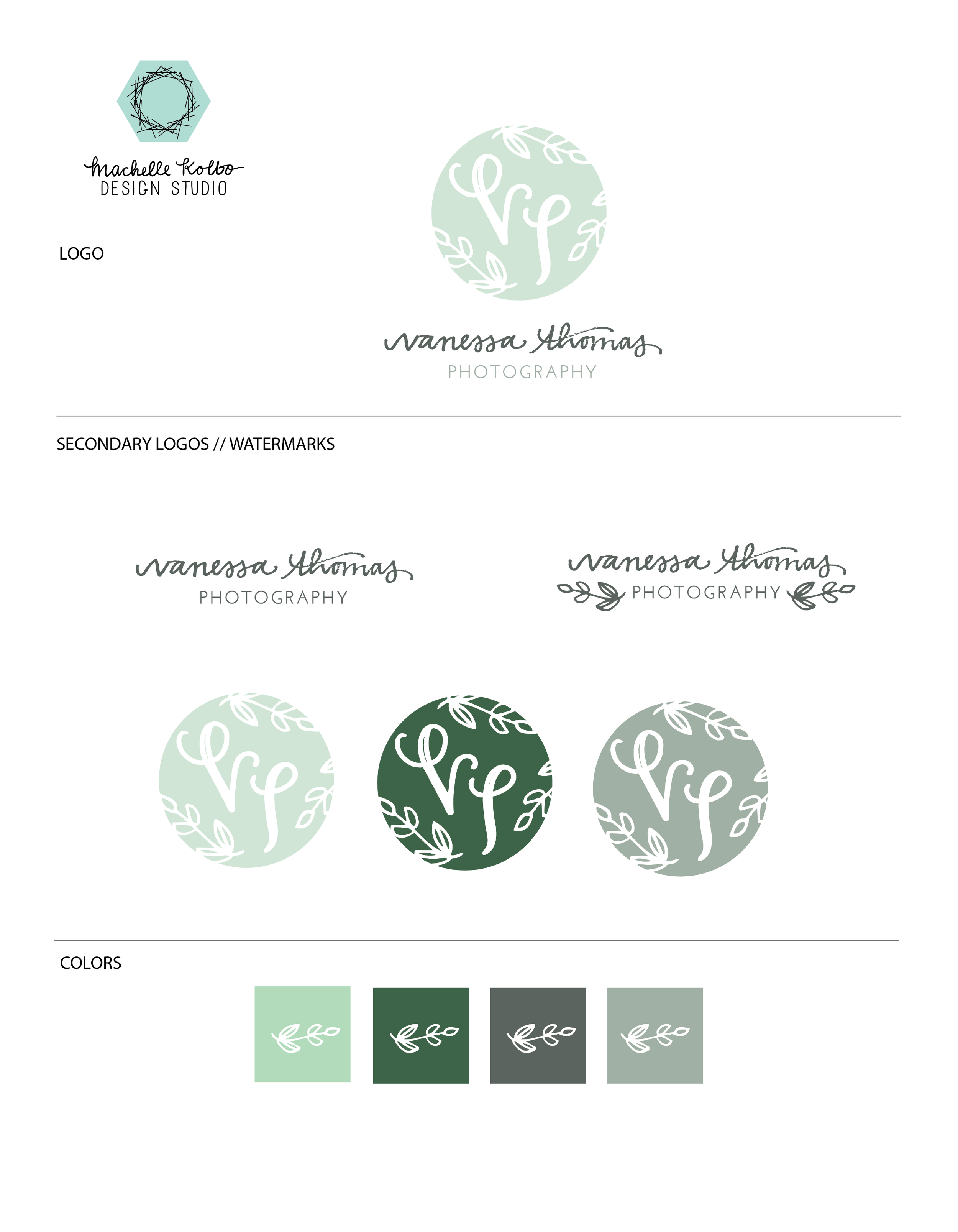

FINAL BRAND

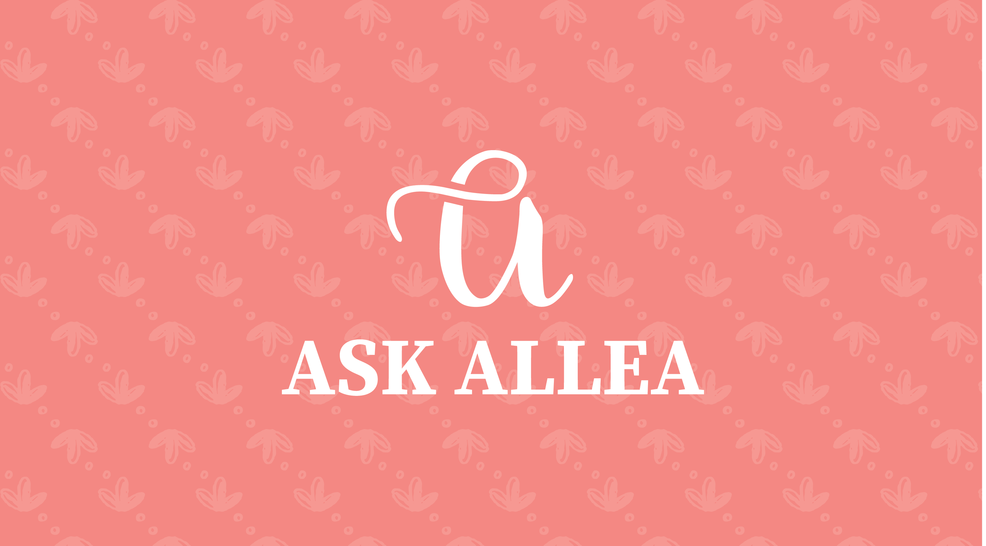
The final brand for Ask Allea feels very warm and friendly. We paired a classic navy, with warm coral and yellow for a bright color palette. These colors are very authentic to Allea and the warmth, friendliness, and sass of the words on her blog. We kept the brand imagery modern and simple with the letter "A" inspired various monogram and drop-cap letters. 

Below you can see the full brand that was created for Ask Allea. Along with the main logos, secondary logos, and brand icons help to pull the brand together and give it an overall cohesive look and feel. Additionally we also created some blog graphics that you can read about below. 

Ask Allea Brand Identity Style Guide | Machelle Kolbo Design Studio

Brand Graphics

In addition to the logos and other brand elements I also created blog graphics. Ask Allea is a website and blog, and so it was very important for her to have cohesive blog headers that could also function on other platforms such as Facebook and Pinterest. Below you can see mock-ups of her blog templates created for the Ask Allea brand. These blog graphics are cohesive with the rest of her branding, and have simple feminine details. Blog graphics such as these look great on her blog and extend her branding to her Pinterest boards as well. 


Check out Allea's website Ask Allea, for helpful blog posts, and coaching services. You can also visit her Facebook page where she posts Ask Allea blog articles, and helpful financial information from other financial bloggers as well. Her information is helpful, real and feels like talking to a friend. I would highly recommend stopping over and reading a few of her posts for yourself. 

Are you a creative or small business owner looking to invest in your brand? I would love to help you create a beautiful brand that captures the heart of your business and gives you a visual identity to propel you to the next level. To learn more head to our Services Page, and then fill out the Brand Identity Contact Form. I can't wait to chat with you about creating a meaningful custom brand for your business. 

Machelle Kolbo Design Studio
 
In Branding Tags Ask Allea, Brand Identity Design, Branding, Logo Design, Lincoln Nebraska Branding Designer, Meaningful Brand Design, Custom Brand, Financial Blog Branding
Comment

Branding: Perch Lettering

July 21, 2017 Machelle Kolbo
Machelle Kolbo Design Studio Brand Identity Design

I love working with other creative entrepreneurs and small business owners on branding for their business. One of my favorite parts of this is that no two projects are ever the same. Plus, I love walking through the branding process, and equipping these business owners to use their new visual identity successfully! The branding for Perch Lettering was no exception. It was also enjoyable to work with another business owner that loves lettering, and spoiler alert - we incorporated her lettering into the logo! 

Michelle, of Perch Lettering, and I connected through social media, and I was so excited to create branding for her lettering business that she has been in the beginning stages of creating. Michelle has a beautiful lettering style, and knew from the start that investing in branding would create a solid visual foundation for her to rely on. I knew that it was important to give Michelle branding that clearly defined her style, and gave her a visual identity of her own. This is important for any business, your branding should speak to who you are, set the tone, and define the image you want to convey. 

Michelle letters lots of wooden signs and goods for the home. The name Perch Lettering came from the the idea that just like a bird rests on a perch, these items would rest in your home and be a resting place. This mission for why she creates lettered pieces is so sweet, and one of the things I was so excited to infuse into this brand. 


INSPIRATION

Since the name of the business is Perch Lettering, birds, perches, and branches were obviously a major part of the style and visual inspiration. The back story to the name, and why Michelle thought of that name also played into the inspiration and heart behind the brand. Through the brand survey we also identified the following words as brand inspiration: cozy, rustic, and home. 

With that inspiration in mind I knew that the branding for Perch Lettering would need to have a rustic modern vibe. I wanted clean lines, simple details, and warm colors, and perch-like details to come together and create the perfect visual identity for Perch Lettering


FINAL BRAND

The final brand feels ever so slightly rustic, modern, warm and inviting. We developed a rich warm color palette that pairs beautifully with a lot of the wood grain that Michelle uses in the signs she creates. These colors also add to the cozy, warm, inviting feeling we wanted the brand to convey. The single branch, or "perch" detail is simple and and adds the right organic/rustic touch to the branding. 

One of the fun parts of this brand was that from the outset, I suggested, and Michelle wanted, was to use her own lettering as a part of the logo. This was a natural way to bring in her style, and let it speak for her business. The "Perch" part of the logo is Michelle's lettering work. I digitally incorporated it into the logo, and think it makes the brand feel even more welcoming. It's a small detail that adds so much personality!

Below, you can see the full branding style sheet. In addition to the main logo, we created some fun secondary logos, and icons. Secondary logos, and icons are great to use on social media, incorporate into product packaging in the form of stickers, and create a cohesive brand experience. 

Perch Lettering Brand Style Guide | Machelle Kolbo Design Studio

BRAND COLLATERAL

One of my favorite parts of this beautiful branding was the business card design. I selected the blush and maroon color from the color palette to be the center of attention. They pair so beautifully, and add such a warmth to this point of communication. I used the main logo, and one of the secondary logo icons to make sure the business cards displayed the brand well. We added Michelle's main contact information, and social media pages to the card as well. 

Perch Lettering Business Cards | Machelle Kolbo Design Studio

You can find Michelle's work here on Instagram, or check out her Facebook page. I am so excited for her to embark on this small business journey with branding that fits her unique style, and communicates her vision. Michelle is available for custom wood signs, envelope lettering, and other fun custom lettering projects, be sure to reach out to her for your custom lettering needs!

Interested in creating a beautiful brand for your creative business? I can't wait to chat with you about that! Head over to the Services Page to learn more, and fill out the Brand Identity Contact Form. I can't wait to chat with you about creating a meaningful custom brand for your business. 

Machelle Kolbo Design Studio
 
In Branding, Design Tags Logo Design, Brand Identity, Brand Identity Design, Branding, Small Business Branding, Perch Lettering, Machelle Kolbo Design Studio
Comment

BRANDING: UPSTREAM FARMS + ENTERPRISES

June 30, 2017 Machelle Kolbo

It is continually a delight to wrap up a brand identity client, and watch with excitement as they release their new branding into the world. The branding work we do encompasses what they are already about, and helps to further communicate that vision to others. My latest branding project for Upstream Farms & Enterprises was no exception. 

I connected with Matt and Joe Brugger of Upstream Farms & Enterprises at a business round-table discussion, through the Engler Entrepreneurship Program at UNL, where I offered design advice to college students interested in entrepreneurship. The Bruggers wanted to re-brand their family farm (which has been in their family since the 1920's), from Brugger Farms to Upstream Farms & Enterprises. Additionally, they want to create new channels of communication between farmers and consumers, and create an identity that would capture all aspects of business they wanted to create as a part of their farm. Their immediate excitement and passion for their family farm, purpose behind their re-brand, and ultimate goal of wanting to be a voice to consumers made me realize this was going to be an exciting project take on. 


INSPIRATION

At the outset of a branding project clients fill-out a brand questionnaire. Within those questionnaires we dive into different pieces of their brand, the why, and the heart behind what they do. 

One of the questions that I love is, "what words do you want people to associate with your company?" Matt and Joe talked about the following words, and a phrase that they feel identifies their heart:

  • Trust
  • Integrity
  • Transparency
  • Work Hard for People

The Brugger's farm has many aspects to it, overall, they are looking to bridge the gap between the farmer and consumer. These words that they want to represent Upstream are exactly how they want consumers to feel when interacting with their brand. Upstream Farms seeks to inform consumers, produce great product, and deliver amazing services. 

From the outset I knew that this brand will represent bridging that gap between consumers and farmers. I also wanted it to represent well the generations of the family that have put in the work to make this farm what it has been, and what it will become. Overall, the Upstream brand has to be one that builds trust, is transparent with information, and works hard for the people it serves.


LOGO CONCEPTS

At the start we were uncertain of exactly what the name of the farm would be. So, some of our initial logo concepts were for Brugger Farms, instead of the final name Upstream Farms. The challenging part of the first stage of any logo is taking all the ideas and inspiration and narrowing it down into a few simple concepts. 

Thoughts while creating the logo included: 

  • Creating a farm logo that balanced rustic and modern
  • How to respect the history of the farm, while still allowing the logo to propel them forward
  • Figuring out concepts that could be adapted if/when the name changed (which it did - to Upstream!)

Here are some of the initial concepts:

BruggerLogoConcepts

All logo concepts start out as black and white, because color can be super distracting at this stage of the process. Color gets added later in the branding process, but at the beginning black and white concepts allow the design to be the main focus. 

None of these concepts ended up being the chosen logo, but the first and third concept largely influenced the final logo that was created. The intertwined letters and partial circle mark of the first concept were used in the final Upstream Logo. 


FINAL BRAND

Using the inspiration, heart, and logo concepts the final brand is a strong logo mark to encompass the entire Upstream Farms & Enterprise operation. We focused on creating a brand that was modern, had touches of rustic, and felt authentic. You can check it out below!

Upstream Farms Final Brand Identity

In addition to the main brand, Upstream will have many arms of their business. So we created additional sub-marks with the 'UP' icon to identify them as a part of the bigger Upstream Farms & Enterprises brand. Overall, the main Upstream logos will be used the most, but we wanted to make sure each part of their operation had a sub-logo to use. 

Upstream Farms Secondary Logos

You can find the Bruggers selling all-natural beef at the Haymarket Farmer's Market in Lincoln on Saturdays. Be sure to also connect with them on social media for fun info on where your food comes from, a look into life on the farm, and where you can find food they have grown! Excited for the future of Upstream Farms & Enterprises, and know this branding is a solid leap in the right direction. 

I'm so thankful that the work I do connects me with other amazing business owners. It is such a joy to create meaningful branding design to represent well the dreams and passions of others. Questions about branding or logo design? Comment below, or shoot me and email HERE!

Machelle Kolbo Design Studio
 
In Branding Tags Farm Logo, Upstream Farms, Upstream Enterprises, Branding, Brand Identity, Farm Identity
Comment

BRANDING: OUTPOST YOGA

May 10, 2017 Machelle Kolbo

I’ve had the pleasure of working with many local businesses on creating meaningful brand design for their businesses. Each client brings something new to the table, but they all have a passion, belief and drive behind what they do.

For Anna Zach, her passion is yoga. She teaches vinyasa and yin classes, and brings her style of teaching which distinguishes her. She enjoys teaching a strong, alignment and anatomy centered classes that encourage focus, presence and precision. She also teaches monthly Lectio Divinia classes. These classes focus on a passage of scripture and use restful and restorative poses to help you focus and reflect on the passage being read. Overall, her focus with Outpost Yoga is creating an unfettered environment for her students to let go.


Outpost Yoga | Machelle Kolbo Design Studio

INSPIRATION

Outpost Yoga seeks to be a refuge for those in a chaotic world. The words unfettered, breathing, and Shalom were all a major influence in the creation of this brand. Inspiration was also found from scripture, “He will cover you with his feathers, and under his wings you will find refuge; his faithfulness will be your shield and rampart.” Psalm 91:4. This brand should make people feel welcomed to a place where they can let go. A safe shelter they can rest along the way.

STYLE

From the beginning we knew this brand was going to be fairly neutral and minimal. We were drawn to strong clean lines, neutral colors, geometric shapes, and organic details. This style is reflected in the strong clean lines, of the bird icon, and limited use of color.

FINAL BRAND

Bringing together our inspiration and style created a strong minimal brand. For the final brand we created a main logo, secondary bird icon, and secondary text logo. These items work together to create a minimal brand that conveys the unfettered atmosphere that Anna strives for with Outpost Yoga.

We also played around with the brand elements to create simple, minimal business cards. These printed pieces incorporate her brand colors and elements in a tasteful way, and stick to the minimal feel of the overall design.


It is always fun to create a brand that represents the heart behind another local business. If you are local to Lincoln, Nebraska you can join Anna for monthly Lectio Divinia classes at Lincoln Yoga Center, or regular yoga at Peak Physical Therapy.  Join her for a class that allows you to step into a peaceful environment and focus. If you can't make one of her scheduled class times she is available for private Lectio Divina classes. 

 
In Branding Tags Branding, Yoga Logo, Logo Design, Lincoln Nebraska, Brand Identity, Outpost Yoga
Comment

BRANDING: VANESSA THOMAS PHOTOGRAPHY

January 26, 2017 Machelle Kolbo
Branding Vanessa Thomas

The design and branding process often begin much earlier than you would think. Brands start being formed in the way you present yourself, what you value in your business, and how you tell your story. Many of those things are being developed long before clients pop into my email inbox looking for help with branding. 

My job as a designer is to dig in and discover the ways their brand has been forming, and to be able to capture that story visually. I was excited to chat with Vanessa Thomas Photography and discover all the ways her story was beginning to form her brand.

Logo Design // Vanessa Thomas Photography // Machelle Kolbo Design Studio

Logo Design // Vanessa Thomas Photography // Machelle Kolbo Design Studio

Vanessa Thomas, of Vanessa Thomas Photography, has a deep passion for photography even though it has been a journey she just recently embarked on. 

Through our conversations it became very obvious how much Vanessa loves her clients and wants to capture their special moments. She approaches her business with gratitude, grace and kindness. These values are deeply rooted in her faith, and show in the heart for her clients.

The only piece missing was a logo and branding that could convey the genuine kindness, natural grace, and sweet simplicity of her photography. I was excited to step in and capture those qualities in branding that will serve her business for years to come. Follow along for how this brand came together. 

Branding: Vanessa Thomas Photography // Text Logo // Machelle Kolbo Design Studio

Branding: Vanessa Thomas Photography // Text Logo // Machelle Kolbo Design Studio

INSPIRATION

A lot of the branding inspiration was found in natural elements of leaves, moss, and greenery. These elements reflected Vanessa's genuine kindness, and desire for natural moments. We changed color direction slightly throughout the project, but in the end landed on the natural green tones.

STYLE 

Vanessa was attracted to illustration and hand-lettered text. A lot of the logo concepts included a mix of both. Illustration and lettering are some of my favorites to incorporate into brands so this was a no-brainer. 

FINAL BRAND

The final branding included a main logo, secondary text-only logos, and multi-colored monogram icons to use as social media images and watermarks. We stuck to a very earthy, natural color scheme that comes across in a beautiful way. The colors and simple feel also capture the feel of her photography. A lot of Vanessa's work captures people with elements of nature in a simple, genuine way. This branding beautifully captures the story unfolding for Vanessa's photography business. 

Branding Board Vanessa Thomas

Overall, this was a fun project to visually represent the story happening in Vanessa's business. With a heart and passion for capturing genuine moments already in place my job was to visually represent that brand through illustrated details, hand-lettering and a cool color palette. I'm thrilled with how it all came together! Want me to dig-in to your branding? Let's Chat!

What are your favorite pieces of this branding project?


Machelle Kolbo Design Studio Branding
 
In Branding, Design Tags Branding, Logo Design, Nebraska, small business branding, brand identity
Comment
Machelle Kolbo Design Studio

Welcome, I'm Machelle

Looking for meaningful designs, and encouraging products? You've found the right place! 

Machelle Kolbo Design Studio Shop

CATEGORIES

Machelle Kolbo Design Studio Branding
Shop Machelle Kolbo Design Studio
Machelle Kolbo Design Studio Faith
Machelle Kolbo Design Studio Social Media

JOIN US ON INSTAGRAM @machellekolbo

Have I mentioned lately that I love getting your custom ornament orders and sending them out to you. It’s a joy to create ornaments that commemorate a milestone, perfectly capture your pet, or make the perfect gift.

Also, can we talk about how
THANKFUL

Thankful for this crew right here. Our crazy little family unit that has lots of fun, laughs, and lives each day to the fullest (aka they have so much energy). 

Thankful for those of you who follow along here, support us, and support our l

SUBSCRIBE BY RSS

Blog RSS

Copyright © Machelle Kolbo Design Studio 2014-2022