Each client journey starts off with a series of questions to gain insight into their business, goals, clients, and of course their specific branding needs. This step always helps us to unearth insightful pieces of information which become critical to the branding process. The words, phrases and language I gather from these questionnaires help shape the design process. It was no different with my latest client, Doula Joyce.
In her questionnaire Joyce used words such as supportive, caring and helpful to describe how interacts with clients and how she wants them to view her brand. Hearing those words, and hearing Joyce's heart for what she does through our consultation phone call, made me excited to work with her to craft the perfect brand identity.
As I mentioned before the name of Joyce's business is Doula Joyce. Although, I don't think business would be the first word she would use to describe what she does. Joyce is a Birth Doula. For those of you unfamiliar with the term a Doula offers emotional, physical, and informational support to women and their families through child-birth. She works with families, before delivery, during labor, and postpartum. She looks out for the emotional well-being of mothers, and offers support alongside the medical team. Her goal is that mothers will experience a sense of wholeness. So, now that you know all that - let's dive into the branding.

INSPIRATION
Armed with the knowledge that this brand needed to convey wholeness, support, and care I set off to figure out the best way to represent that. Through Pinterest inspiration, research, and brainstorming I decided we needed something organic to encompass this concept. Imagery such as circles, water ripples, feathers, and flowers all felt very simple and inviting.
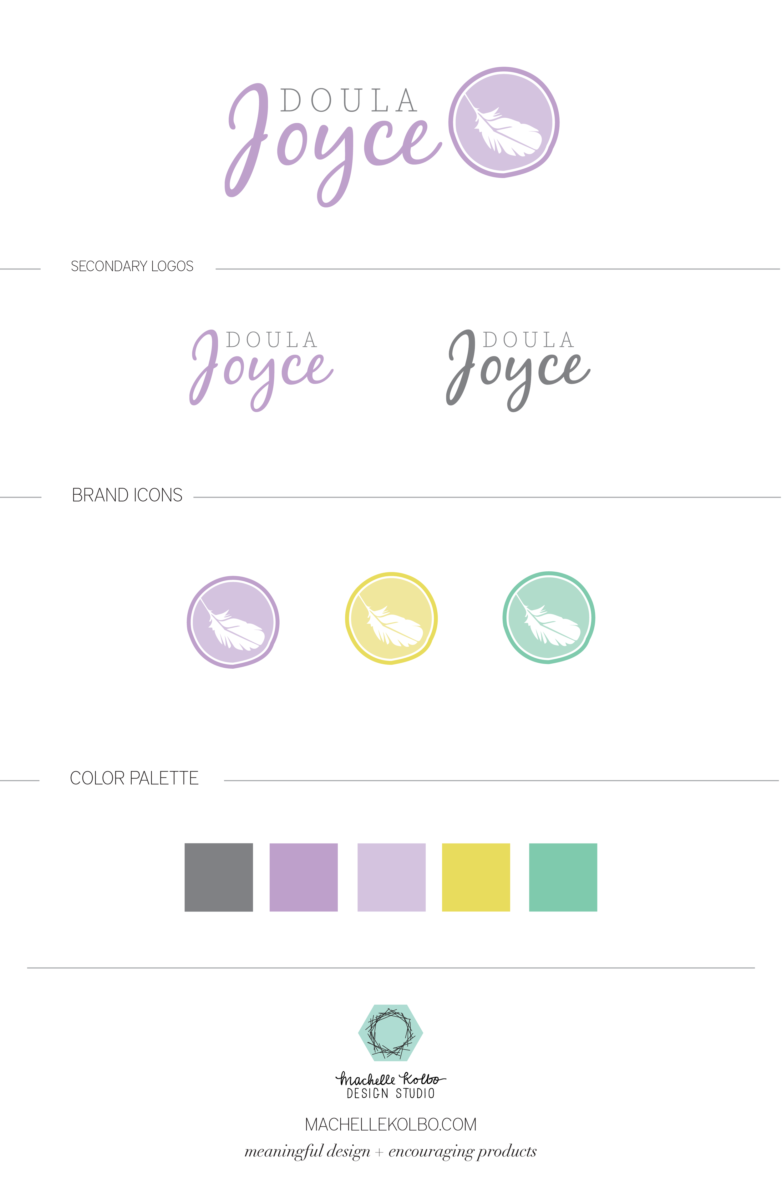
FINAL BRAND
The final branding captures the elements of wholeness, support and care with feminine simplicity. We chose to incorporate circles, and a feather element to give us simple organic imagery. The playful soft brand colors feel warm, inviting, and suit the families she will serve. Check out the full brand below.
BRAND COLLATERAL
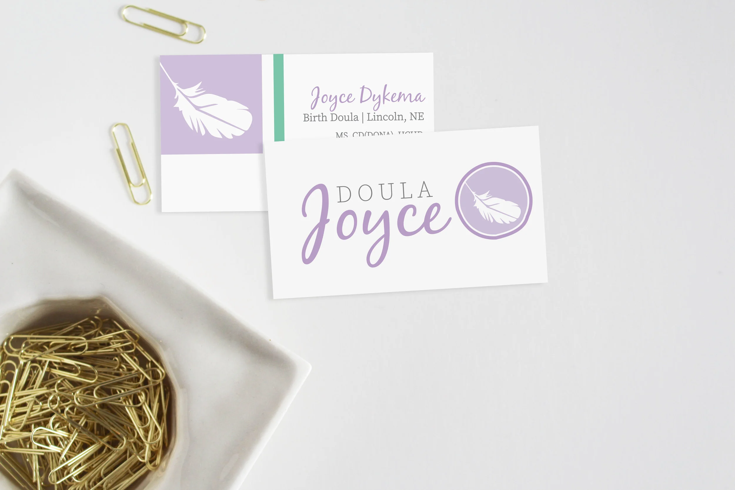
As a part of the branding for Doula Joyce, we created business cards to extend her brand to printed collateral. These darling cards incorporated a few of her brand colors, and the feather imagery in a couple of different ways. Business cards will give her an easy way to further communicate her brand, and maybe an important point of contact.
If you are interested in finding out more about Joyce and her Doula services available in Lincoln, Nebraska you can find out more information over here on her website.
Are you a creative entrepreneur or small business owner looking to take your branding to the next level? Let's chat about how we can give you a custom visual identity that will communicate with your customers, and embody why you do what you do.